Paletteful Packs – August 2022 | Part 2
This blog post was brought to you by my Ko-fi supporters.This is part 2 of my August 2022 Paletteful Packs blog post (it was getting too long, so I had to split it into two parts). Below you can read about my thoughts on the supplies from the August 2022 pack and you can also check what I drew with them!
To learn more about Paletteful Packs click HERE.
My thoughts
The initial tests
Below you can see my first August supplies tests. What I needed to know was not only what the charcoals (and the pastel!) look like when put on paper but also if they are erasable and how easily they blend.


According to my tests, all the supplies (of course except the liquid one) blended the best with a paper blender which I happened to have from years ago and never really used it. The chamois which was a part of this Pack’s contents wasn’t my favourite blending tool – it left too much texture which I didn’t like.
All the dry charcoals were easily erasable but of course the thicker the charcoal layer, the worse it erased.
Surprisingly, the Lyra Rembrandt charcoal seems water soluble but I’m not sure if it really is, or maybe it’s just the charcoal dust from the top layer spreading with added water.
The tools
Canson Dry Mixed Media paper
The main art supply of this month is charcoal and its variants – that’s why we got liquid charcoal in the box, even though this month’s paper says it’s meant for dry media, so in theory, it shouldn’t work well with any liquid medium. Surprisingly, the Canson paper wasn’t that bad for the liquid charcoal. It didn’t bend too much, although applying water to the paper initially darkened it, so it was difficult to say where I added pigment and how much of it, until the water dried.
As I mentioned in part 1 of the post, the paper has a very distinct sandy texture, so it’s perfect for dry media like charcoal, pastels or pencils. I expected the texture to make the paper very delicate and easy to destroy, but it wasn’t the case. Working with the paper was very pleasant and it’s definitely durable – neither erasers nor the charcoals destroyed it (…with exceptions, which I’ll talk about in a moment).
Overall the paper was perfect for the task! I usually like smooth surface papers the most but this Canson paper was a pleasure to use.
Lyra Rembrandt Carbon Pencil
It’s definitely a good quality charcoal in pencil. The core is very smooth and soft. It has a beautiful, dark shade, as close to black as it gets. I had absolutely no issues while working with it and will definitely come back to it with my next charcoal project.
Stabilo CarbOthello Pastel Pencil
This soft pastel also was soft and smooth and worked great with the charcoals and Canson paper. The only thing I didn’t like about it was a lot of texture left by the pastel even when blended, but it’s not that big of a deal. The pastel is great and that’s what I stick with.
Nitram Academie Fusains charcoal sticks
These charcoal sticks seem very fragile at first glance and are indeed very soft but they are unexpectedly durable. They don’t stain hands even though they draw on paper very easily. They are very uneven when shading larger areas but they smudge and blend incredibly easily which can be good or bad, depending on the situation. The sticks surprised me with how reliable they are – they didn’t break even once despite their softness and apparent fragility. They’re definitely a high-quality supply.
General’s Charcoal pencil
I didn’t like this charcoal pencil – it was very unpleasant to work with it. Its core has a very uneven texture, with some sort of hard bits in it that ended up scratching the paper. It was the case even after sharpening the pencil several times and on top of that – the core was also broken inside. When put on paper, the charcoal was fine to blend and I liked its medium hardness but it was an absolute hassle to use it in General (see what I did there?) and I’m happy I don’t have to work with it anymore.
Princeton Heritage brush
I’ve already reviewed this brush in my January 2022 pack blog post. It’s a great brush that worked perfectly for both liquid charcoal painting and blending dry charcoals and pastels. If you’re not sure if it’s a good enough brush to buy – yes, it definitely is.
I ended up not using the big Robert Simmons brush and chamois for my artworks this month, but I’m sure both are great for what they are intended.
The sketches
As always, before starting the final artwork I wanted to tame the supplies a bit by giving them a go in simple drawings.
I decided the subject of my first drawing should be an apple because I wanted to have some good associations with drawing apples and I still had the nightmarish memories of trying to paint an apple with Ecoline markers on a horrible paper.
The Canson Dry Mixed Media paper is so thick and dense that I couldn’t use my lightbox to trace the lineart onto it, so I had to figure out a different way to do it. I usually use carbon tracing paper when it comes to my acrylic paintings, but I definitely didn’t want to use it with charcoals because, well, first of all, my tracing paper is blue rather than black, and secondly – the lines transferred with such paper are very hard to erase and I wanted the drawing to look natural.
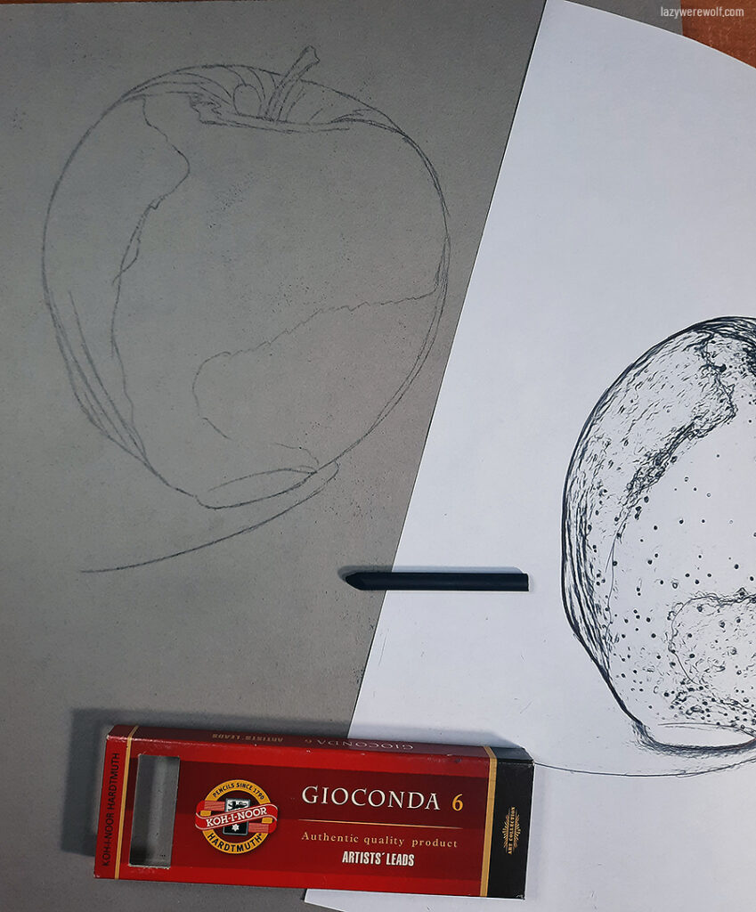
When trying to figure out what to do, I remembered a technique I saw a while ago somewhere on the Internet, in which you cover the back of your lineart paper with graphite, pastel or charcoal and it becomes the transfer layer when you trace your lineart. I decided to give it a go. For my transfer layer, I considered the Nitram charcoal sticks but I was worried the lineart transferred this way would be barely visible, so I used Koh-I-Noor Gioconda Artists’ Leads charcoal (which wasn’t in this month’s box!) and it worked perfectly – the traced image looked fine and clear. Although the transfer layer left charcoal dust everywhere on the paper, there wasn’t as much of it, as I expected.
The next thing to do was clean the paper from the charcoal dust and I did it by using the black Tombow Mono eraser from the pack. It worked great but left a lot of tiny eraser shavings, which was annoying, because after removing the charcoal dust from the paper, I had to remove these things too while trying not to smudge the lineart. I think kneaded eraser would be much better for this task, but alas, it wasn’t part of this month’s pack.
With the lineart prepared I could start shading the apple. For the first layer of light shading, I used Nitram charcoal sticks and blended them with a paper blender. This first layer came out quite uneven but the second layer, added the same way, fixed it.
For the medium shadows, I used General’s charcoal. The pencil form of charcoal was much more precise than the sticks but otherwise, this supply was horrible to work with. In fact, the very first moment I touched the paper with this pencil, it instantly started scratching the paper rather than drawing on it. Fortunately, I was very careful with placing the shadows and managed not to destroy the paper and sharpening the charcoal fixed the problem. My trust in the tool was instantly gone though and it made me wary about the pencil for the future. I had a similar experience with cheap colour pencils in the past – sometimes their cores have a lot of hard particles that end up destroying the paper.
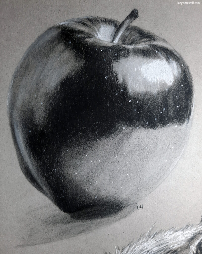
…and sadly it was the case with the General’s charcoal pencil. I had to sharpen it every few minutes to get rid of the hard bits and even that didn’t always help.
In the contrast, the Lyra charcoal was amazing to work with and perfect to add the deepest shadows as it had a soft and very dark core. However, the soft core made it difficult to blend – even after blending it with the paper blender there was still a lot of the texture visible, so I had to blend it with General’s charcoal instead and it looked much better.
After finishing the shadows I decided to add highlights with the Stabilo CarbOthello pastel to make the image more lively. Princeton Heritage brush worked great for blending this supply and adding highlights was the right decision in my opinion – the drawing on toned paper looks much better with them.
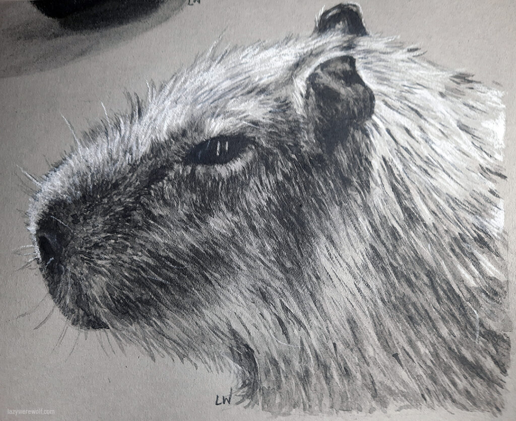
I had more space on the page, so I decided to give the crazy Nitram liquid charcoal a chance. It was leaking and exploding months after I received the package but now, half a year after that, it seems to be quiet. It reminds me of a dormant volcano that can wake up at any time and knowing this supply may cause cancer, makes it actually pretty scary. Fortunately though (or maybe not?), back when I took it out of the box, the liquid charcoal had a lot of spillage from the tube, but I saved the spilt bits that were dried now and due to the charcoal being very easily liftable, I was able to use those bits I saved, rather than squeezing more of it out from the tube.
For this second exercise, I chose a capybara portrait because I absolutely love these adorable animals.
I transferred the sketch the same way as I did with the apple and shading with liquid charcoal was fairly easy, as it reminds me a lot of watercolours in usage, except it doesn’t flow that well and seems to be more liftable than the watercolours I’ve tried so far.
Another similarity to watercolours is that you can’t erase Nitram liquid charcoal with an eraser even after it dries on the paper.
This liquid charcoal dries dark grey – it’s not as deep in colour as Lyra charcoal but you can use this or a different traditional dry medium on top of it. I decided not to add deeper shadows, but I did add highlights with the Stabilo white pastel.
Both exercise drawings I treated with fixative to secure them from smudging. I was worried that the liquid charcoal would dissolve in it, but fortunately, nothing like that happened and both drawings have been secured just fine.
The artwork
For the final artwork, I used the same tools and techniques as for the apple sketch, including tracing the lineart. The General’s charcoal kept misbehaving and scratching paper to the point I was about to stop using it, but I managed to finish the artwork without completely ripping the paper or throwing this pencil out. Using it was a big struggle and made the whole process much less fun than it could have been though and I’m actually pretty mad at it.
Fortunately, I had enough patience to finish the image, for which I chose the ELEPHANT prompt.


Final thoughts
I liked working with charcoals a lot, despite the issues with some of the supplies! Until now I was not fond of charcoal too much, even though I’ve always loved drawing and shading with pencils. Charcoals for some reason always seemed.. too complicated. Kind of like oils in comparison to acrylics.
But to be honest, I absolutely loved drawing both the apple and the elephants and the way the finished drawings look. I’m actually impressed and I definitely didn’t expect it. To be honest, it’s probably one of the reasons I didn’t manage to find time earlier to work with these supplies.
Now I’m very happy I gave charcoals a try. They were similar to draw with to drawing with pencils, but the end results were slightly different. I love how matte the charcoal drawings look in comparison to pencils, but to me, pencils still seem more suitable for detailed work, although it could be just my lack of experience with charcoals.
This journey with charcoals makes me want to try Pitt Graphite Matt pencils – which are, in theory, graphite pencils, but they are matt. I have a feeling they are as easy to use as regular pencils but with their matt finish, they look as good as charcoals. And I think I might like them. But that’s a subject for another time.
How about you? Have you tried charcoals or are you intimidated by them like I was? Or maybe you’re a charcoal master and would like to share some tips? Please do! Or just come and say hi 🙂
~Kat

