Acrylic painting: Pondering Fairy (process)
Hello everyone, in today’s blog post I’d like to show you the process of creating my recent Pondering Fairy painting 🙂
First of all, it was made using November 2021 Paletteful Packs supplies – you can read more about them here.
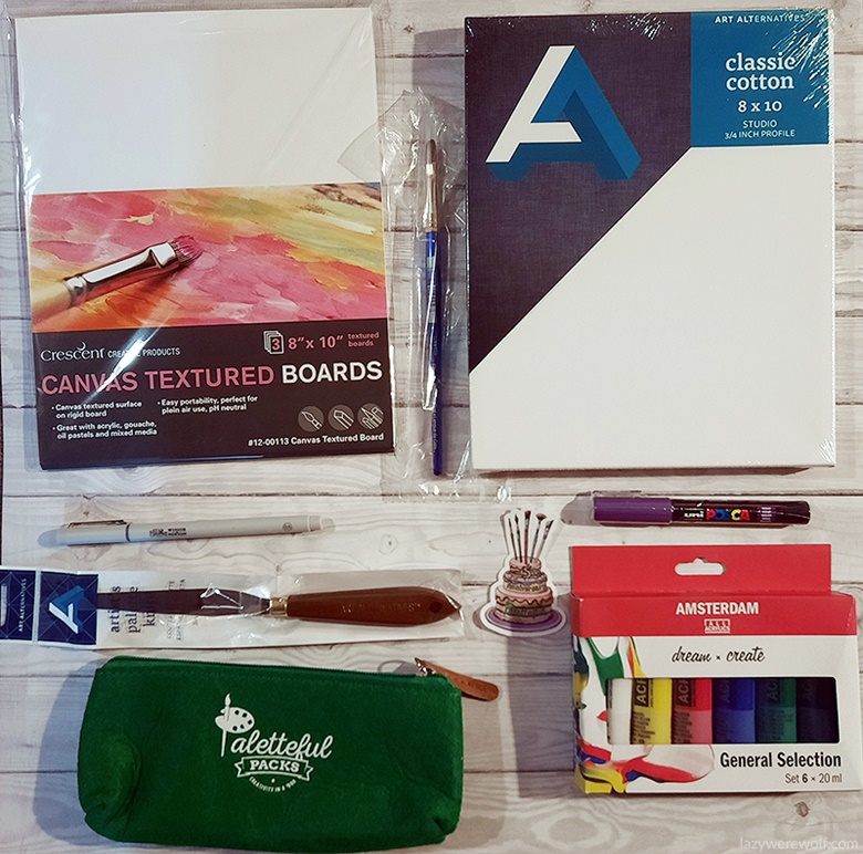
The tools I used:
- Standard Series Acrylics General Selection Set 6 × 20 ml
- POSCA Paint Marker, Extra-Fine Bullet – Violet
- Robert Simmons Sapphire Sable-Synthetic Blend Brush
- Art Alternatives Artist Palette Knife
- Crescent Canvas Textured Boards – 8″ x 10″
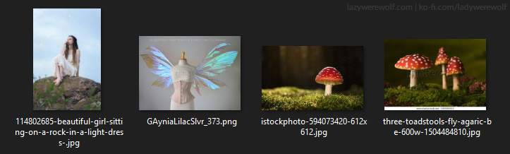
I started the process by looking for inspiration – I googled fairies and fairy aesthetics. I really wanted some iridescent and close to transparent looking wings, so googled those too. I noticed fairies often are surrounded by toadstools and I found some beautiful pictures of them that gave me an idea about the colours and general setting of the image. What was left to figure out was a pose for the fairy and at that point, I already had an idea of what I wanted it to be, and luckily I found exactly the reference I needed. Here you can see what my reference folder contained:
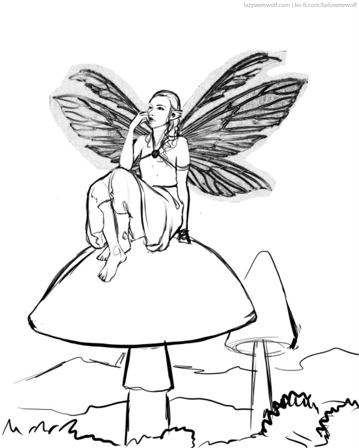
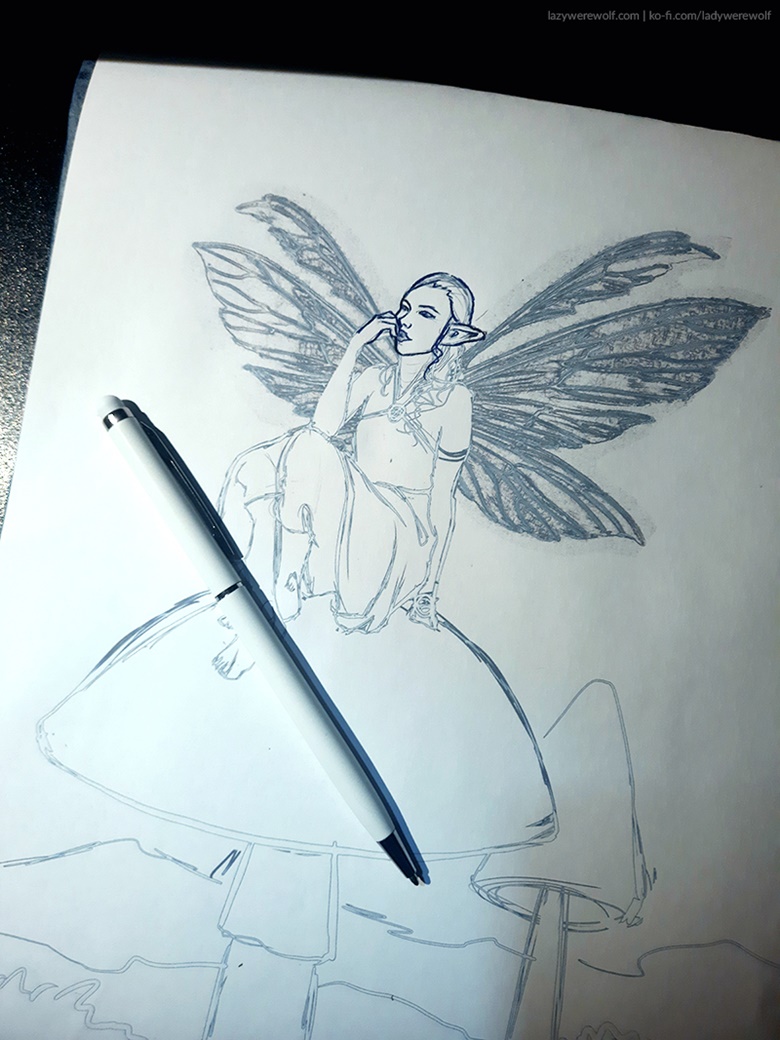
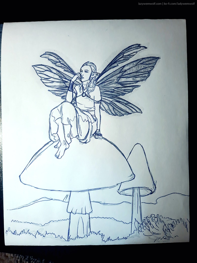
The next step was a sketch. I made it digitally in Clip Studio Paint. It didn’t have to be very detailed except for the fairy, especially her wings. I drew the fairy by hand using the reference image but the wing sI wanted to be perfect and I’d have needed way too much time to eyeball them good, so I used a filter on their reference photo to get nice lines that I could easily transfer to the canvas.
Here is what my sketch/lineart looked like:
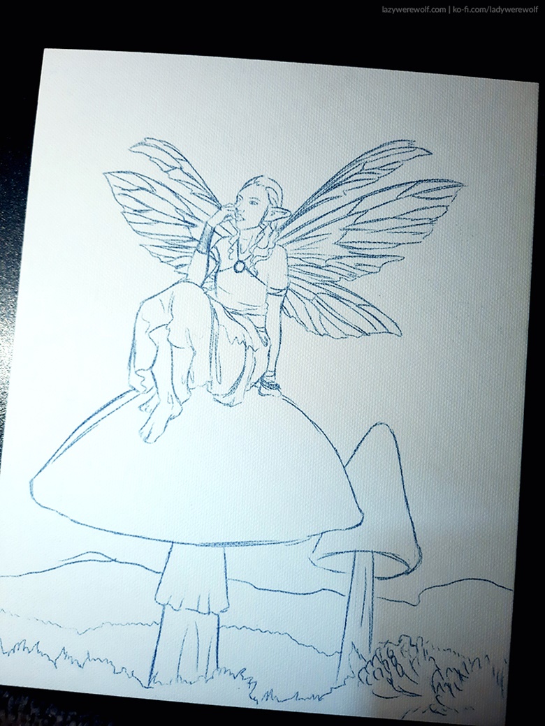
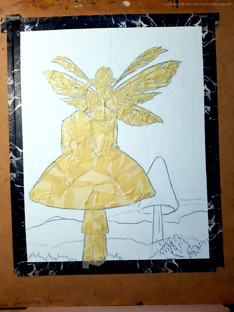
The next thing I had to do was to copy the digital sketch to the canvas board. I used my usual procedure for it: print the lineart in the exact size of the canvas, attach it to the painting surface and trace it using carbon paper.
In the case of the fairy image it printed out weird though, for some reason (only the outlines of the lineart), and I couldn’t figure out what was I doing wrong, because I’ve used exactly the same methods as usual, so I decided to just trace the print I got.
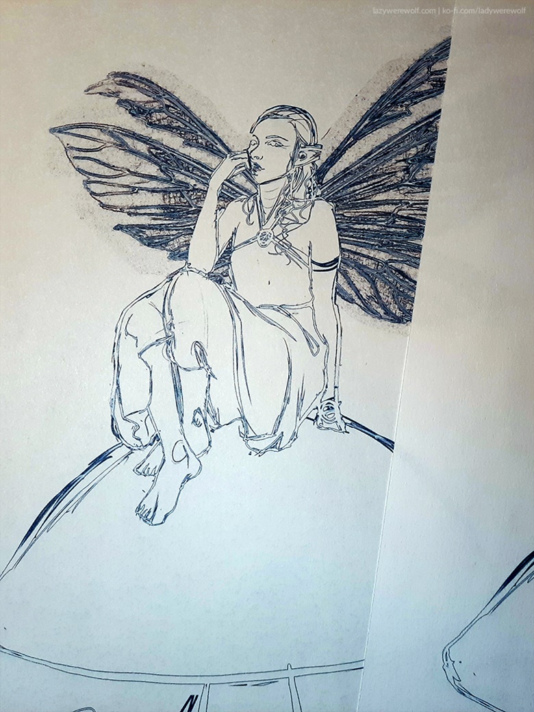
I attached carbon paper and the print to the canvas board with tape and started tracing the sketch. You can do it even with a stick if you don’t want to mess up the sketch but it’s much easier to use something like a pen or a pencil that leaves trails on the traced image because then you know which lines you’ve traced already and which ones you haven’t.
I was going to use acrylic paints that are opaque (or should be anyway) so, as I said before, the sketch didn’t have to be perfect, especially in the areas that don’t have to be precise, like grass, moss, plants in general.
The lines I got from the carbon paper seem dark but it wasn’t a problem since I intended to cover them all with paint anyway. The sketch came out a bit wobbly though because of the issues with the print I had earlier, but it was good enough to work as a base for the painting.
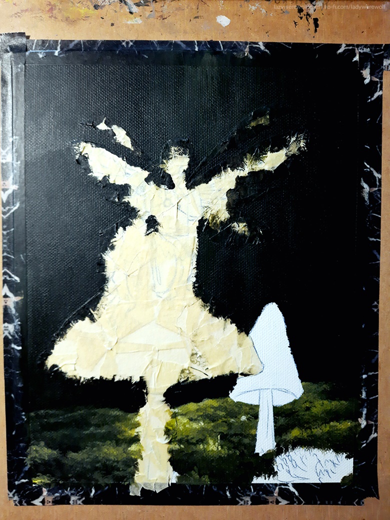
Now that I had the sketch ready I could prepare it for painting. I attached it to my clipboard desk with washi tape but a regular masking tape would work too. Washi tape just looks fancier but works the same. At this point, I haven’t realized yet that I should have attached it before tracing the image but I’ll later show you why it was a problem.
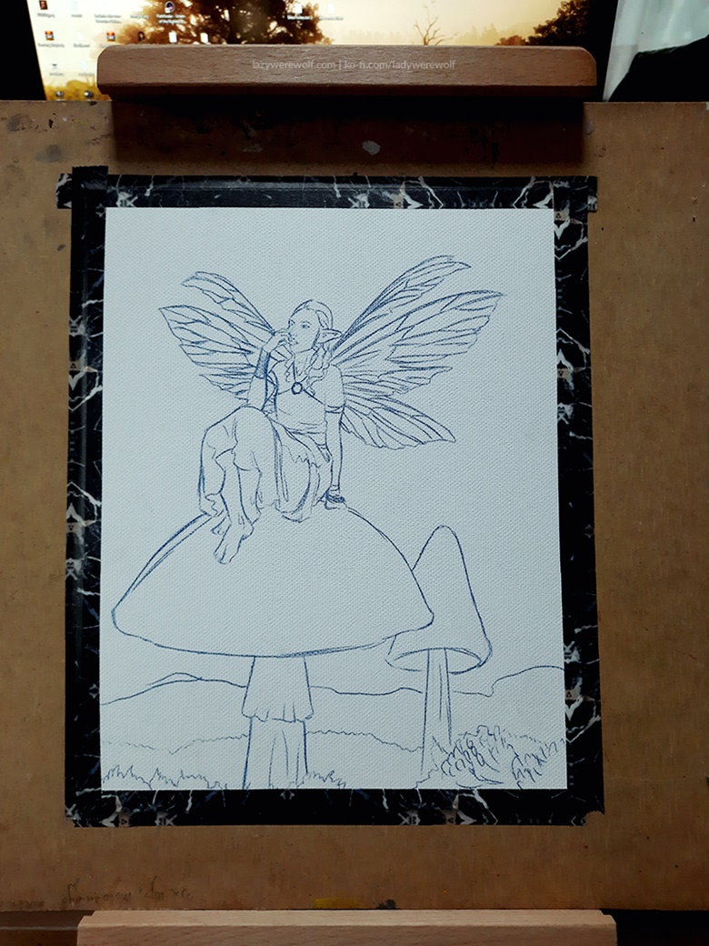
While planning on how to paint various areas of the image I realized it may be difficult to keep some of the details clean, for example when painting the background, and that may affect either the time I spend on painting or the quality of the finished picture… or both. So I decided to give masking tape a chance and learn how to use it efficiently at the same time.
Since I was about to use a lot of it, I used regular masking tape for covering some areas of the painting rather than washi tape this time. Washi tape sure looks cool but is also much more expensive than the regular masking tape so it would get too expensive if I used washi tape instead.
The set of paints I used was just 6 colours: Titanium White, Primary Yellow, Pyrrole Red, Ultramarine, Permanent Green Deep, Oxide Black.
The choice of colours and their opacity were problematic at some points which I’ll tell you about later.
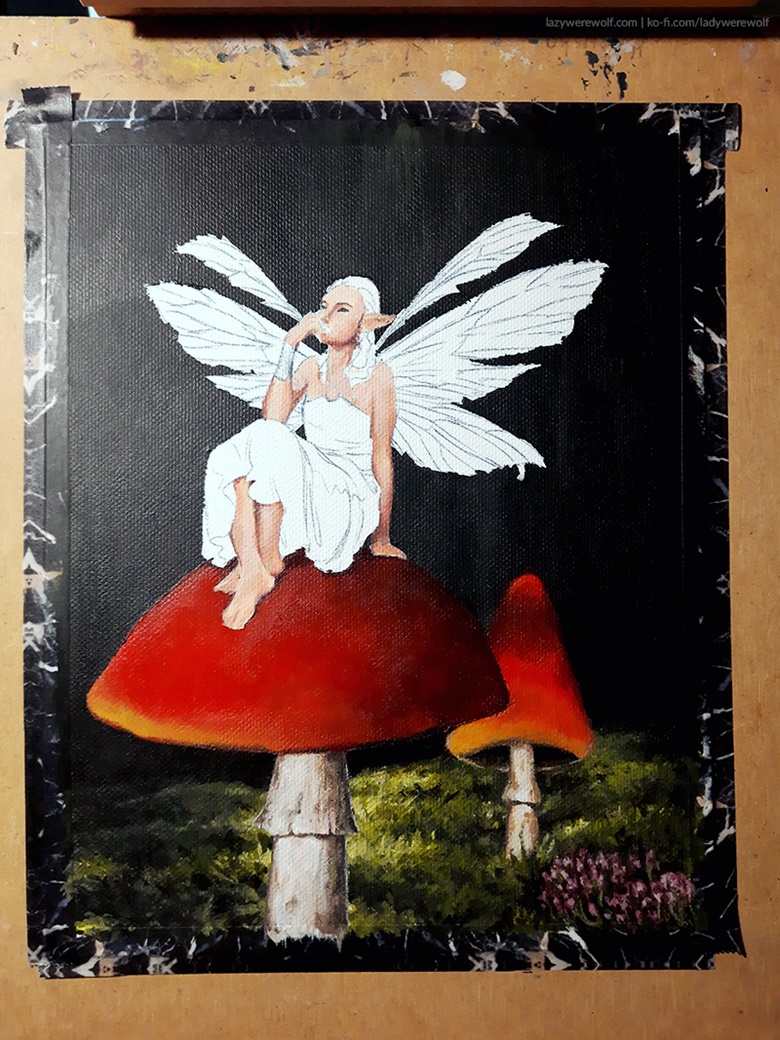
After I started painting the background I realized it would be easier if I add the masking tape on the small toadstool too so did that and continued with the background.
I used mostly black paint with some yellow for highlights (which you probably won’t see in the photos 🙁 ). this is when I noticed the yellow paint is quite transparent. The yellow paints usually are somewhat transparent when it comes to acrylics but I was still surprised how transparent this one was.
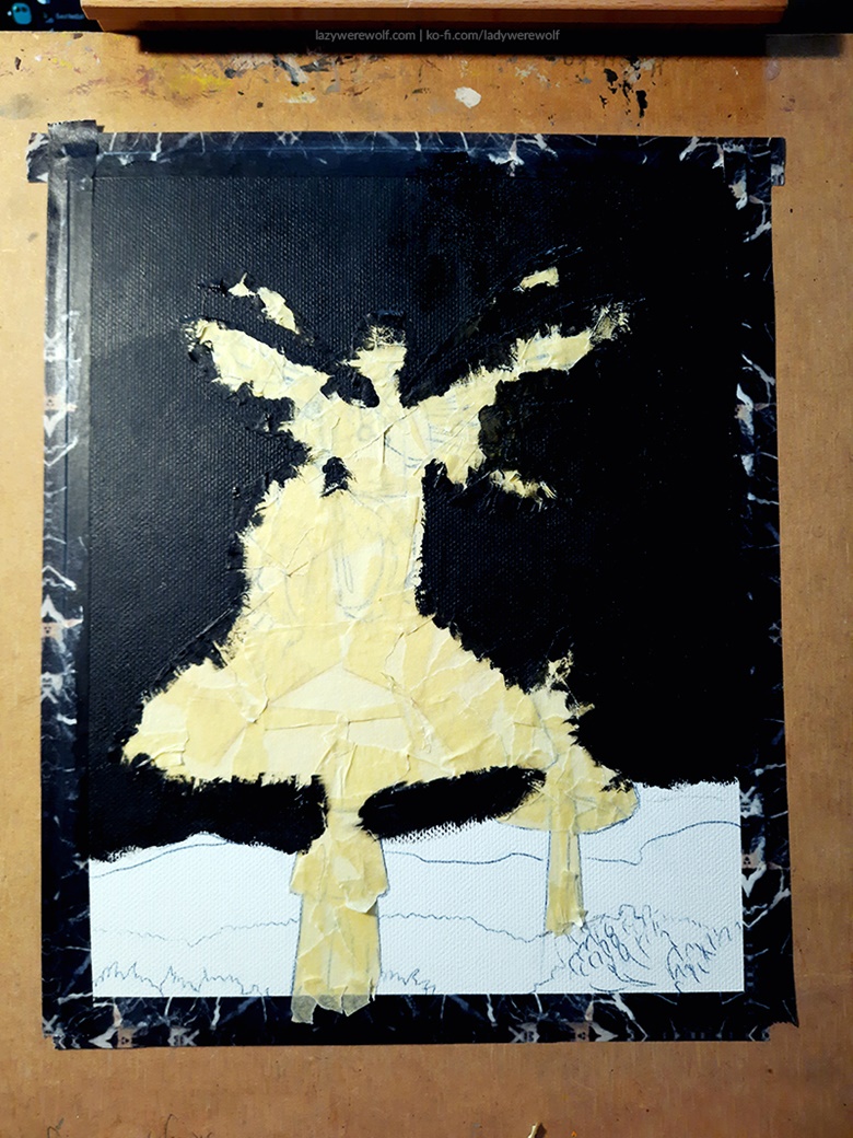
After the background was mostly done I moved on to painting the moss. It was quite pleasant actually. In the set of paints I got, there was a green colour but I didn’t use it much because it had a completely different shade than I needed (it was too blue!) and so for the moss I used mostly yellow and black. As I said before – the yellow paint I had in the set was more transparent than expected so I used quite a lot of it for the moss.
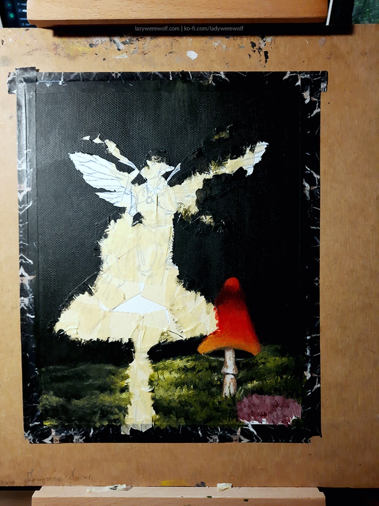
When the moss was more or less finished I could start taking the masking tape off the smaller toadstool. I must say it was quite satisfying. But what I noticed was that the tape didn’t give me fully clean lines – some of the paint went under the tape and some came off with the tape which in effect created some jagged edges but it wasn’t something I couldn’t fix later.
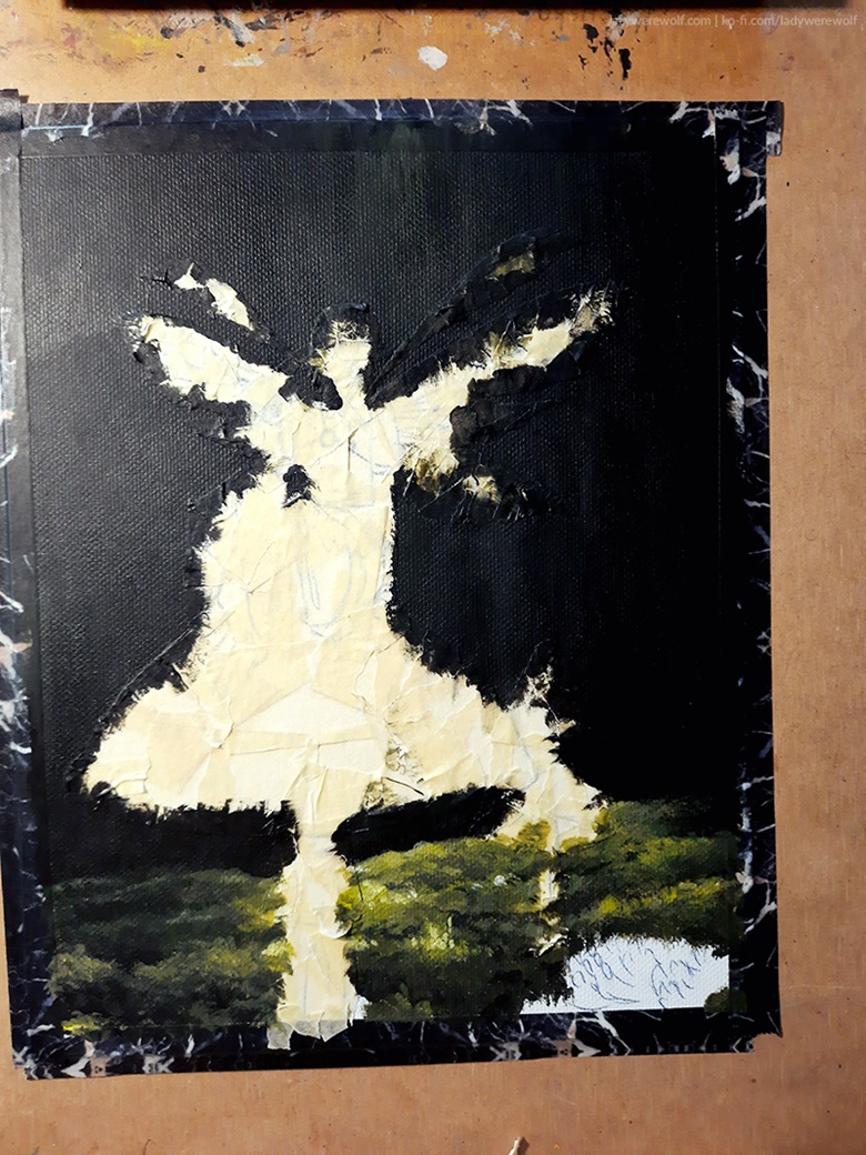
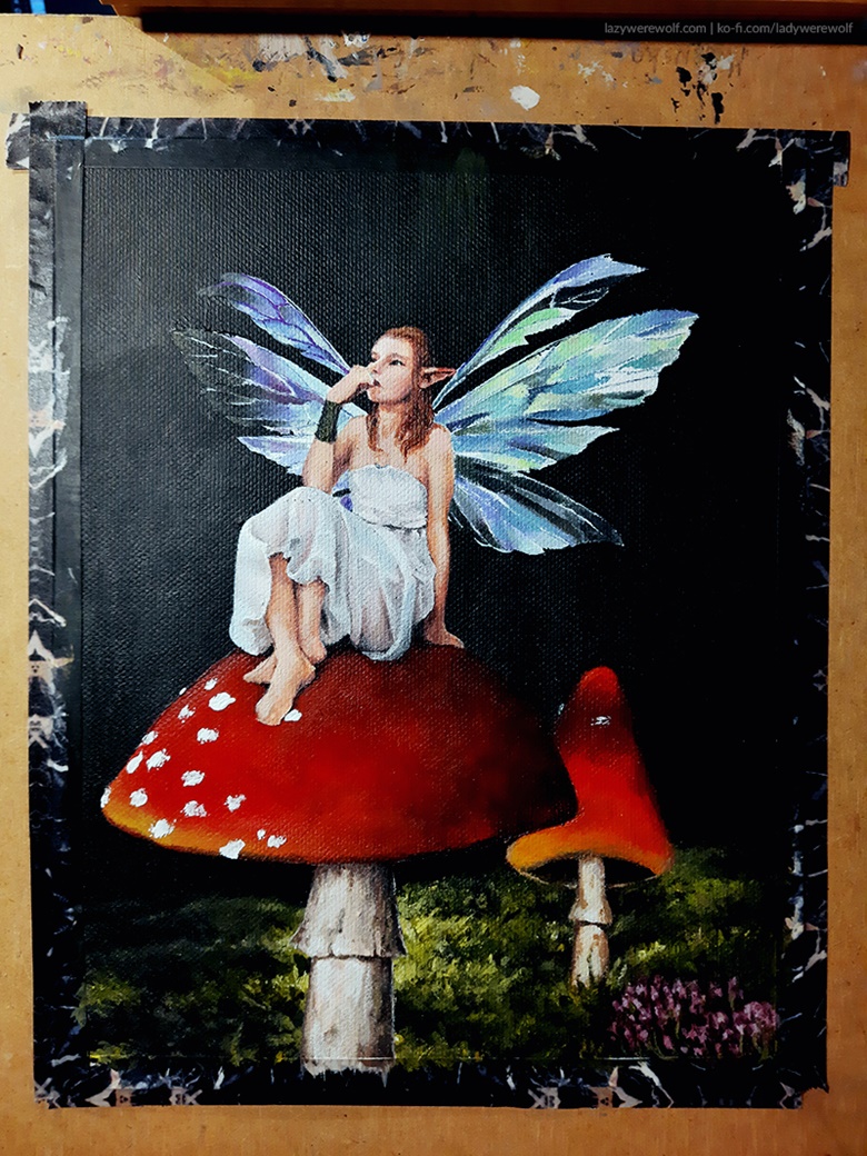
Next, I started painting the small toadstool and the heathers in the lower-right corner of the image because the white unpainted space was bothering me a little 🙂 I was also curious about how did the fairy look with the tape taken off so started to remove the tape from the fairy.
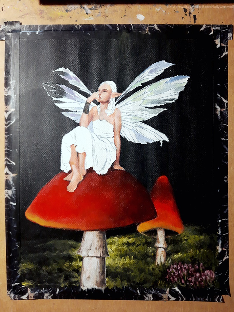
While adding some orange and yellowish colour to the toadstool’s hat I struggled with the transparency of the yellow paint again. I needed to put down a LOT of layers for the colour to be at least close to what I needed.
As I suspected, the fairy’s edges weren’t smooth under the tape, same of course in the case of the big toadstool.
I kept the tape on the lower part of the fairy to be able to paint the toadstool freely without worrying about painting over the fairy’s legs and dress. I also added some tape on the already painted small toadstool to mask it.
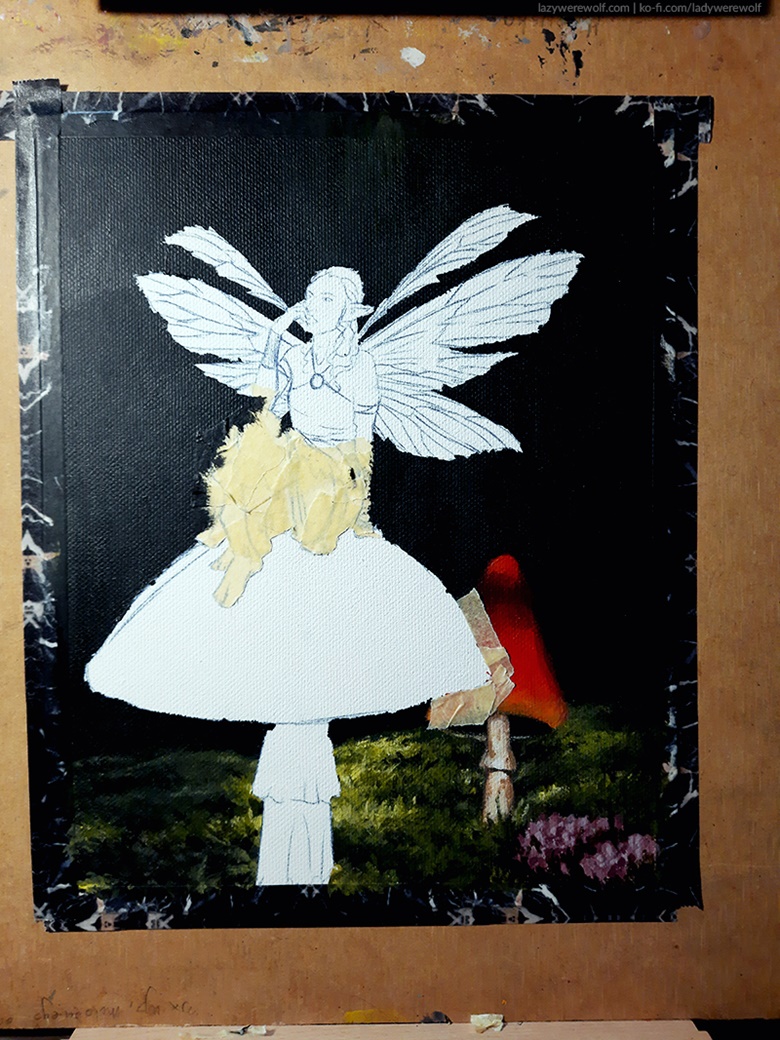
I must say the tape worked great at this point, I was impressed by the effect and realised I should use it more often in my painting process – it makes things so much easier and faster!After finishing the big toadstool the base for both mushrooms was done so I could remove the tape from the fairy and start painting her!
I started with painting the Fairy’s skin.
Then I began to add some colours to the wings. It wasn’t easy with the set I got since Ultramarine was too much on the purple side for me and I couldn’t easily get a cyan shade from it but with adding some of the green paint from the set and mixing in some yellow it somewhat worked.
Another colour I had a problem with while painting the wings was red. It was too orangey, so I couldn’t get a nice purple from mixing it with blue – that’s why I decided to use the violet Posca pen I got in the Pack for the purple shades. It’s an acrylic paint marker and so it works perfectly with water and mixes with regular paints, too.
For the transparency effect on wings, I used black paint mixed with yellow.
Then I just kept adding more colours to the wings and kept fixing the skin and hair of the fairy.
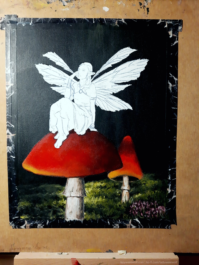
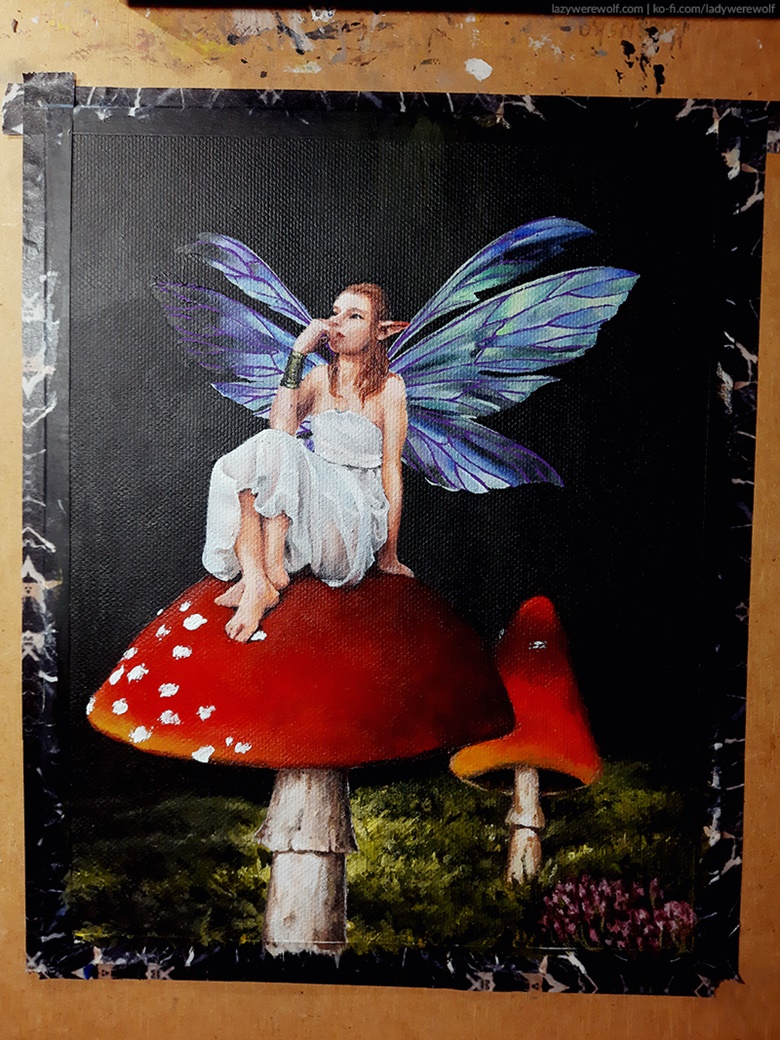
I also decided to use the Art Alternatives palette knife for the toadstools’ white spots for a more 3D effect.
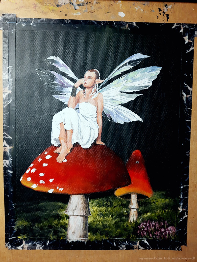
After working a bit more on the wings and skin I felt like the dress needed some shading too, so started to paint it.
I finished painting the light areas of the dress and decided to finish the wings next.
One of the things that were bothering me about the wings was the jagged edges left from the masking tape so I fixed those edges.
After I was done with adding the colours to the wings I used the Posca marker to add the veins to them. Next, I continued fixing the fairy’s face, skin and hair.
Before polishing the image and fixing the details I finished adding the spots to the toadstools. I used the palette knife again for that and then added some shadows and reflections around the spots with a brush.
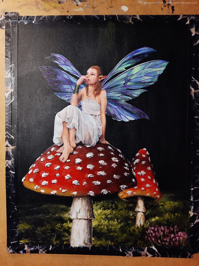
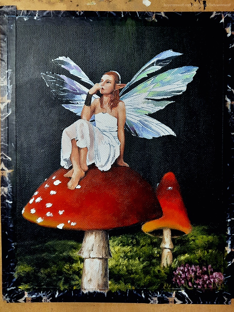
After finishing the mushrooms I added some details to the dress, gave the fairy some jewellery and fixed her face.
Then I took the washi tape off from around the image and that’s when I realized why I should have first attached the image to the clipboard and then trace the sketch, not the opposite – the lines from the carbon paper were hidden under the washi tape the whole time!
I was able to remove the lines from the carbon paper from the canvas with a kneaded eraser but I’m pretty sure if it was paper rather than a canvas board, the carbon paper lines would be either non-removable or the process of removing them would destroy the paper, so I was lucky here.
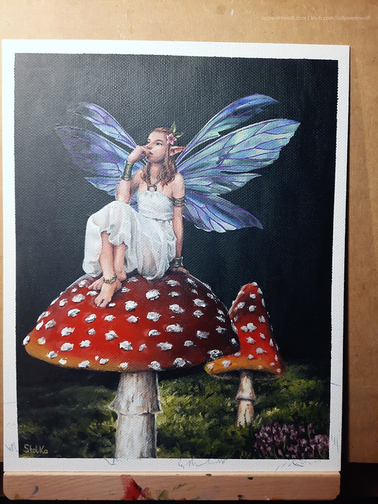
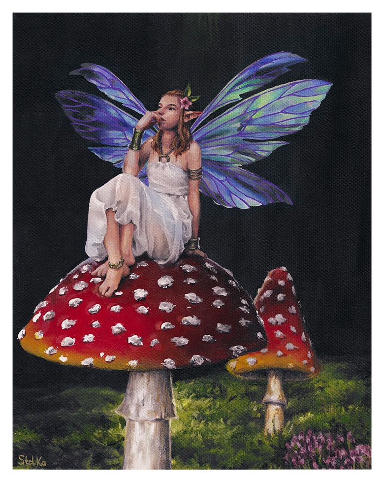
That concluded the process of painting the fairy picture! Below you can see a scan of it with colours adjusted so they resemble the original as closely as possible 🙂
I must say I learned a lot of new things while working on the painting. I’ve never used masking tape in my acrylic paintings before, haven’t used a paint marker either (tried, but I failed!), nor the palette knife. I’m happy not only the painting looks ok but also that I keep improving my techniques!
Do you have any questions? Don’t hesitate to ask! I’ll gladly answer any question or give you tips on painting if I have them 🙂
