Markers testing
*coughs* First things first and since this is my first post here I feel obligated to say “hi”. So – Hi 😉 But seriously – I felt this strong need to get a place where I’d be able to write and post freely whatever I want, since on my website i only want to post finished art and places like Facebook Page, tumblr or Instagram are not good for long posts.
So here I am and for a good start I have some art markers tests/short review. They are not big tests of huge amount of markers but still it’s something I did and someone may need it. Like I could in the future when I forget everything but shhhh.
So what I bought is listed below:
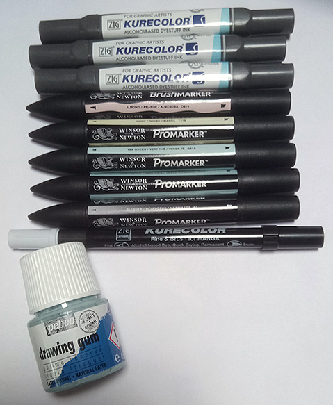
- Kurecolor Twin: Pale Beige, Pale Blush, Vanilla
- BrushMarker: Almond
- Promarker: Ivory, Tea Green, Grey Green, Blender
- Kurecolor Fine&Brush for Manga: Ice Blue
- Pebeo Masking gum/liquid
I already have some Promarkers so I pretty much
know how they work but I was really curious about the rest of markers i got and of course the masking liquid which I never had an opportunity to try, but I haven’t done a lot of testing on it yet.

Promarkes, Kurecolor Twins and Kurecolor Fine&Brush for Manga (let me call this one F&B for short) have a hard fine tip. Promarkers and Kurecolor Twins have a wide hard tip besides that and Kurecolor has a brush tip instead. Brush Markers have a brush tip and a wide hard tip on the opposite side. On the left there is a comparison of fine tips of the markers I have.
I’m very used to Promarker fine tips which are not the most comfortable thing ever to colour with in tiny spaces but as I said I’m used to it. But it seems those tiny spaces are a thing that Kurecolor Twins will be very good at because of their tip. I’m not a fan of it on larger areas though, where even Promarek fine tips are ok. Kurecolor Twin fine tips have very sharp and stiff endings and I can’s say I’m a fan of them but they may come useful in certain conditions.
All the wide tips are similar: in Promarkers, Brushmarkers and Kurecolor Twins.
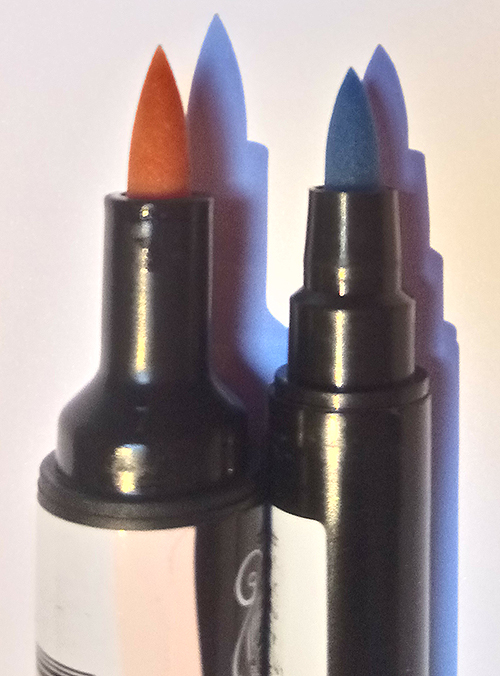
Brush tips in Brushmarkers and Kurecor F&B are similar in shape and size but F&B is a bit smaller. Their softness is also similar, not a big difference here. My personal feeling is because the Brushmarker tip is bigger and slightly more narrow towards its end, it’s easier to make a thin line with it but on the other hand when you make a full width line with Brushmarker it runs out of the ink faster than the Kurecolor one, which may be both good and bad but I need to do more testing on that.
The general shape and design of the markers differs too and I really have mixed feelings about it. First Pro- and Brushmarkers. What I like is a cap indicating which tip is underneath and in case you switch the caps there is a graphic indication of the tip on the marker’s body too. The label also is showing the colour of the marker so it’s very useful if you quickly want to found a specific shade. The names of the colours are also printed there.
In comparison to this Kurecolor Twins are kind of annoying – they do have the names of the colours printed on additional labels from which the paint is already coming off. Besides that the only information you have about the marker’s colours is on its caps so you should make sure to NEVER EVER accidently mix them with other markers’ caps. But unlike Pro- and BrushMarkers the Kurecolor Twins are square, not round, so they won’t roll off your desk, that’s the plus. The only one.
Kurecolor F&B are round and much thinner than the other markers. They are round so they will roll off your desk if you’re not careful. The fine tip is marked by grooves near the ending of the marker so it’s pretty convenient to tell which tip is which even if you switch the tips. BUT. The only colour indication besides additional sticker label (from this one the paint is coming off very quickly too) is one of the caps. And it’s not even a name of the colour it’s ONLY the coloured tip. It’s the worst marker colour indication I’ve ever seen.
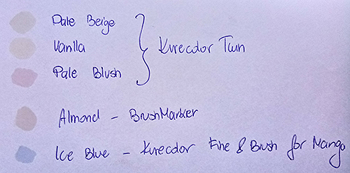
As for the colours I absolutely love all of them. The photos are terrible quality, but, sadly, I took a lot of them and also scanned the images and nothing showed the actual colours better, so please deal with the quality 🙁 I bought 4 + 1 skin (or so I thought skin colours plus some additional ones).

The Kurecolor Twin markers I bought were: Pale Beige, Vanilla and Pale Blush. I expected Pale Beige to look different. In reality it’s, well, probably what the name suggests and I misexpected it – it’s has too much of a gray shade in it to my liking. Vanilla ended up looking almost the same as Promarker Ivory – the difference here is barely notice’able. I was trying to at least catch a difference in blending to decide which one I like more but more about blending later. Pale blush shade is pure love but because of the fine tip I have mixed feelings about this marker – for me it would be much better with a softer tip, either one like Promarkers have or a brush tip.
Brush Markers: Almond. Much love here, too. I’ve seen people complaining about this colour being too washed out, not vivid enough. And me, being different from everyone else as I always am, loves this colour a lot. And it has a brush tip which makes it even better. I especially love the way it looks when shaded with Kuretake Pale Blush. Much more like actual skin tones than yellows Ivory + Vanilla + Saffron I used to use. This one Brushmarker made me order more of them!
Promarkers (not included on the photo because I wasn’t testing it, I already had one but it ended): Ivory. It’s usually my basic lightest skin colour. But because I love the Almond so much I also ordered Kuretake F&B Porcelain in hope it will be closer to Almond shade and will make a good light base skin colour.
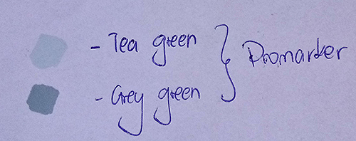
Additionaly I bought Kurecolor F&B Ice Blue for shadows on white objects (like whites of the eyes) and Promarkers Tea green and Grey green because they seem perfect colours to draw a certain character’s clothes but in the end they look completely different than on digital colour charts what happens too often. Unfortunately to draw that chartacter I’ll most probably will have to order different shades of markers.
My blending tests shown at first that unlike Promarkers, Kuretake markers neither blend good with each other, nor with Promarkers and that disappointed me a lot. Fortunately I gave them another chance on a better paper (better than printer paper I mean) and everything blended nicely on it so I’ll probably get more Kuretake markers in the future.
Below are some examples of how skin colours I got look together.
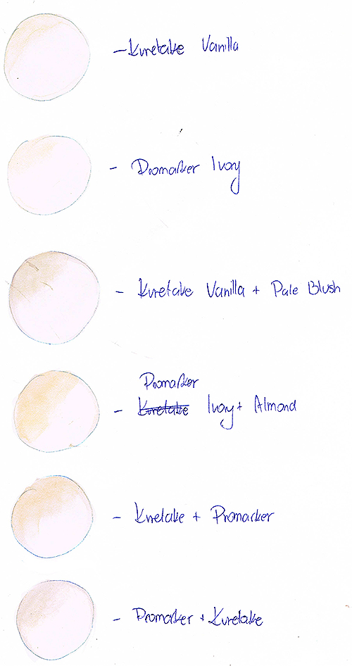
The colour representation here is not 100% correct but the scan shows the blending test results quite well. As you can see shading Kuretake Vanilla with the same colour results with bleaching the whole thing. Promarker Ivory whish is pretty much the same colour blends with itself very nice so I think even on better paper I’ll use this marker instead of Kuretake, just to be safe.
Because of failed Vanilla blend test I was really surprised when Pale Blush didn’t actually bleach it so it gave me a hope for these markers to be not as bad as I thought at first.
Promarkers and Blushmarkers blend pretty good as expected from markers coming from the same company.
The last 2 examples were my tries of telling a difference between Promarker Ivory and Kuretake Vanilla by them blending with the other brand’s markers, bo no actual difference here either, only in colours I used to do this.
I wanted to do some more tests though, like what the colours would blend like on an actual drawing so i did some quick sketches to see how the colours would blend together in them.
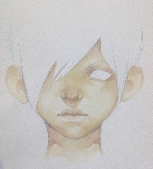
That’s the first one, still on a printer paper. And back to the photos to show the colours more accurately. So this crooked sketch is done with Ivory, Pale Blush and Almond markers, I was only goind to use Promarkers at first but I got too curious and added Kuretake too and they surprised me positively. But on the neck the markers started to bleach each other so I got an idea of trying them on a better paper, which is also a yellowish (Canson paper for the win <3)
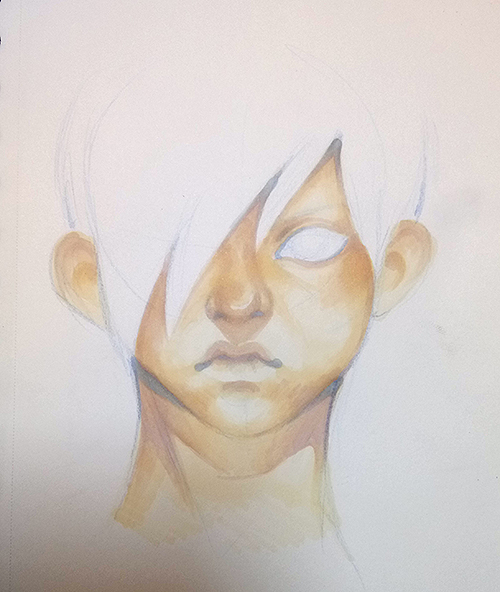
These are the same markers but the colours look much more intense, which is both good and bad, depending on what effect you want to achieve. My thoughts were it’s too yellow. I mean yellows are ok when you draw manga style but on more realistic face it looks weird if all the rest of the drawing is not yellowish too, and not always it’s the colour pallete you want to use, so I decided to try something different.
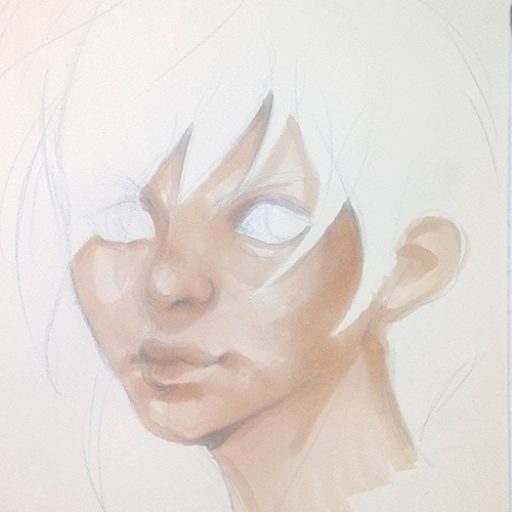
The last sketch took me literally like 2 minutes, but I absolutely love the colours and they may become my new default skin colouring markers. I used Almond here and a some Pale Blush. Since I happened to like the pink-ish skin tone better than the yellowish, as I said earlier, I ordered Kuretake F&B Porcelain becaue on the digital colour chart it looked like it would match Almond and Pale Blush. But I know too well that colour preview images rarely look like the actual colours so we’ll see about this one. I’m also concerned if the F&B brush tip will be good for covering the face surface as a base colour so this is another matter for testing.
Aaaand I guess that’s it for now. I only did tiny tests on the masking liquid and I already learned several things but I haven’t used it for an actual drawing yet so this subject I’ll also leave for one of the future posts here.
Thank you so much for reaching this point of this long post, if you did – you’re awesome. I hope it wasn’t too boring and I’ll try to make the next ones shorter 🙂
